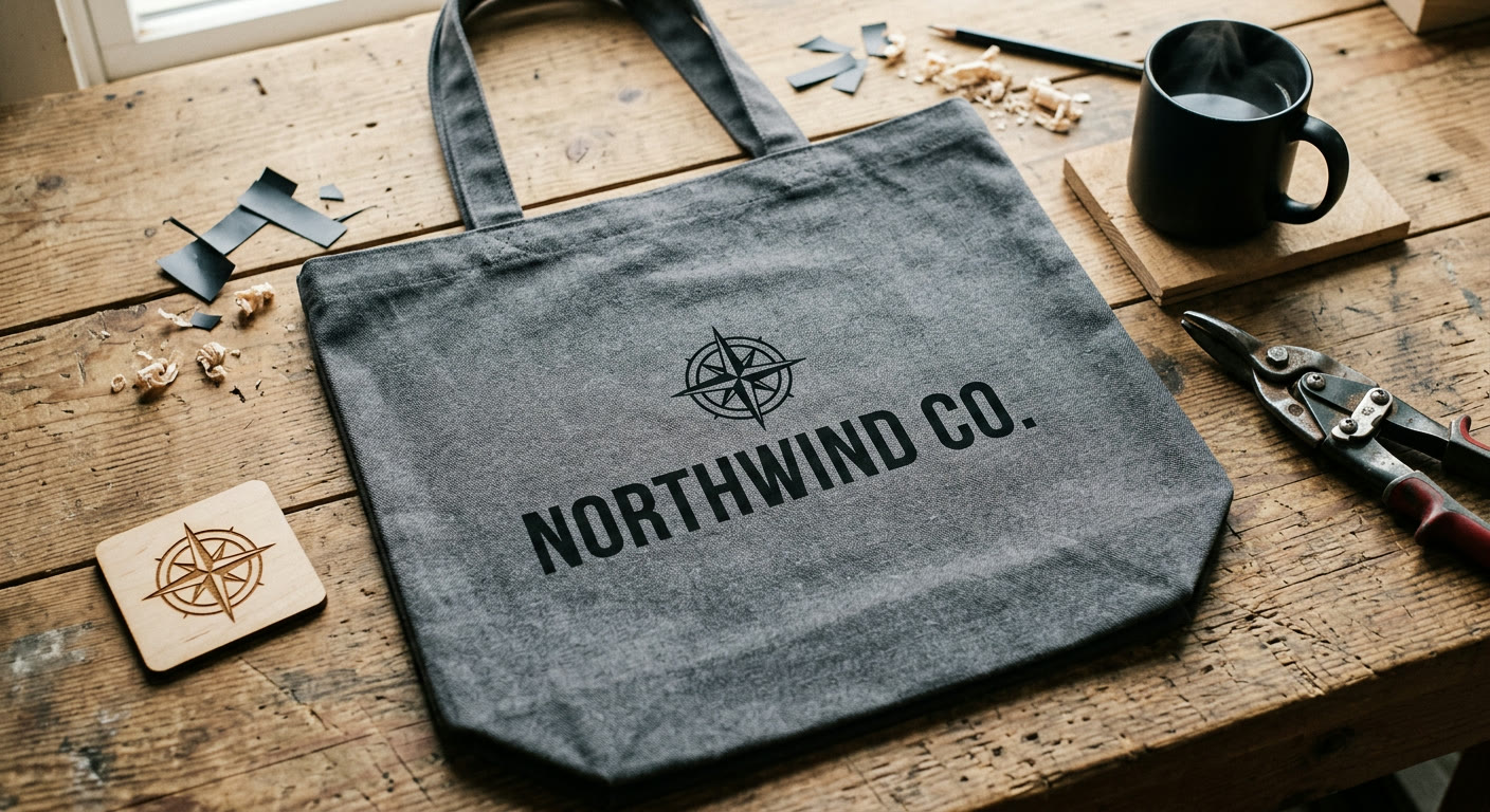
How to vectorize a logo for print, merch and laser cutting
Turning a PNG logo into a clean SVG takes about a minute if you know which settings to adjust. A practical guide for getting vectors that actually print, embroider and laser-cut cleanly, without paying for Vector Magic or opening Illustrator.
Your designer sent you a logo as a PNG. Or you made it in Canva. Now the print shop is emailing back asking for "vector format" and you are not sure what to send them.
I have been on both sides of that email. This is how to turn a PNG or JPG into a clean SVG in about a minute, without paying for Vector Magic or opening Illustrator.
Why a PNG will not cut it for print
PNGs are made of pixels. Zoom in far enough and you can see the grid. Scale one up to fit a tote bag or a banner and the pixel grid gets huge, so the edges turn into staircases.
SVG works differently. It describes the logo as lines and curves, which means the print shop can render it at any size without losing sharpness. Screen printers, embroiderers, laser cutters and sign shops all prefer it for exactly that reason.
The good news is you do not need Illustrator to make one. You need a decent source image and a tracer that handles the conversion for you.
The 60-second version
Go to svgsnap.com. Drop your PNG or JPG into the upload box. Pick your settings (more on those in a minute). Click convert. Download the SVG. Send it to whoever asked for it.
It is free, does not need a signup and runs in the browser.
Start with the biggest version of your logo you can find. A 200px favicon will give you a mushy SVG no matter what you do. A 2000px master traces cleanly almost every time.
Settings that actually matter for logos
Three settings do most of the work: color mode, detail level and smoothness.
Color mode. Fewer colors usually wins for logos. A flat black-and-white wordmark wants two colors, not full color. Full color mode is for illustrations and photographs, and it produces bigger, busier SVGs that print shops tend to complain about.
Detail level. Lower is usually better for a logo. High detail picks up pixel noise around the edges and bakes it into the vector. For a clean wordmark or a geometric icon, drop detail and let the tracer ignore the noise.
Smoothness. Raise this for logos with curves, like a signature script, a leaf or any organic shape. Keep it low for geometric marks where sharp corners are the whole point.
There is no single right combination. If the first result looks wrong, change one variable and run it again.
Prepping the SVG for each use case
Screen printing and DTG. A clean two or three color SVG is ideal. The print shop separates colors from your vector paths. If your SVG has ten colors, they will charge you for ten screens.
Embroidery. This one is the source of a thousand support tickets. Embroidery machines do not actually read SVG. They need a DST or PES file, which the embroiderer digitizes from your SVG by hand. What matters for you is sending them a clean, high-contrast vector with well-defined shapes. No gradients. No fine lines thinner than about 2mm at final size.
Laser cutting and Cricut. Here the difference between strokes and fills matters. A stroke tells the laser or blade where to cut. A fill tells it where to engrave or leave alone. Most tracers output fills by default, so if you want your logo cut out of vinyl or plywood, you usually need to convert the outer outline to a stroke before the cutter accepts it.
Large format printing. Banners, car wraps, window decals. SVG just works here. No extra prep.
If an embroiderer tells you your SVG will not digitize, they usually mean the file has thin strokes, text that has not been outlined or gradients. Flatten everything to solid shapes before you send.
When the result looks wrong
If the first convert did not land right, here is what the usual failures mean.
The output is pixelated. Your source is too small. Run it through the image upscaler first at 2x or 4x, then vectorize the upscaled version. I have watched this rescue logos that looked hopeless.
The edges are wobbly and noisy. Raise the smoothness setting. If that does not help, drop the detail level.
Thin lines have disappeared. The opposite problem. Raise detail and lower smoothness.
The file is huge. Too many colors. Switch to limited color mode and pick only the ones that actually matter.
Most logos trace cleanly in one pass if the source is big enough and the settings match the mark. Try it at svgsnap.com with your own file. If the first result is off, change one setting and run it again. The convert is free and there is no limit on how many times you can retry.